The reply was correct. Nobody could tell.
Two replies to my agent carried the same facts. One got a thumbs up, one got a thumbs down, and the difference wasn't accuracy — it was whether the verdict survived contact with the reader.
I used to think “correct” meant the facts were right. My agent has taught me that’s only half the definition. The other half is whether I can find the answer before I stop reading.
I went back through 798 of its replies that I’d rated thumbs up or thumbs down, looking for what actually separated them. Not whether it was right — checked separately, and it usually was on both sides. What I was after was: given two factually fine replies, why does one get a thumbs down?
It isn’t length
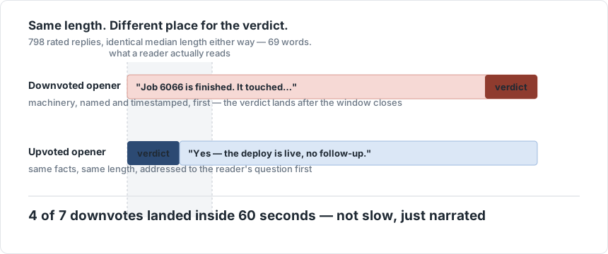
First guess, and it’s wrong: the downvoted ones aren’t longer. Thumbs-up and thumbs-down replies have the identical median length — 69 words, both sides. I keep coming back to this number because it kills the easiest explanation. It’s not that bad replies ramble. It’s not that good ones are terse. Length was never the variable.
It also isn’t speed. Four of the seven downvotes I could time landed inside 60 seconds of asking. They weren’t slow replies I got impatient with. They were fast replies that still failed.
What was actually different: the first sentence
Here are real openers, paraphrased down to the sentence that mattered, sorted by which pile they landed in.
Downvoted:
“Job 6066 is finished.”
“A worker is running.”
Upvoted:
“Yes —”
“Nothing right now.”
“My fault.”
Read them again as a reader would, mid-task, glancing at a phone. The downvoted pair are both true statements about the system. Grammatically they have no relationship to any question I asked — they’d be exactly as true if I’d asked nothing at all. The upvoted pair are all direct answers to a question that was actually in my head: did it work, is anything waiting on me, whose fault was that. Same information architecture underneath, almost certainly — a job finished, a worker started — but one version required me to translate “job 6066 is finished” into “does that mean it worked,” and the other one just told me.
That translation step is the whole bug. It’s small, it costs maybe two seconds, and it is exactly the two seconds a person on their phone doesn’t have.
The wall of text hides the verdict by shape, not by being wrong
Take a fuller example, close to a real one:
I looked into the timeout you saw. The client library retries with exponential backoff capped at 30 seconds, and the server was rejecting the third retry because the connection pool was exhausted under load. I’ve bumped the pool size and added a circuit breaker so it fails fast next time instead of queueing. This should resolve what you were seeing, though I’d keep an eye on it for a day.
Nothing in that paragraph is wrong. But the answer to the only question that opened the conversation — is this fixed — is the word “should,” buried in the second-to-last clause of the fourth sentence. You either read the whole thing or you gamble.
Yes — pool exhaustion caused it. Bumped the pool size and added a circuit breaker. I’d still keep an eye on it for a day.
Same facts, almost the same word count. The only structural change is that the verdict moved to word one. Nothing about this needed a table, a card, or a model rewriting anything — I’ve written elsewhere about the machinery for turning replies into cards, and none of it would have helped here. This is a sentence-ordering problem, not a rendering problem, and it’s the more common of the two.
Over-formatting hides it too
The failure runs the other way as well, and it’s worth saying because it’s the one people don’t expect from a post about formatting. This is “correct” markdown and it’s worse than prose:
| Field | Value |
|---|---|
| Result | Failed |
| Cause | timeout after 30s |
versus:
Failed — timed out after 30s.
The table isn’t wrong. It’s just structure applied to content that had none to reveal. Two facts don’t need a header row, a delimiter row, and two label cells before you get to the two words you actually came for — that’s four extra tokens of scaffolding and two eye movements (find the label, find the value) standing in for one. The token cost of that scaffolding is its own post; the point here is narrower: a table is a claim that the content is comparative or multi-dimensional, and when it isn’t, the table is lying about the shape of the answer, the same way “Job 6066 is finished” lies by omission about whether that’s good news.
What “correct” has to mean for a reply
Put together, the rule I’d defend: a reply is correct only if the facts are right and the verdict is reachable inside the reader’s actual attention span. Not “technically present somewhere in the text” — reachable, meaning it survives someone reading exactly as much as they were going to read anyway, which per this data is often about the first sentence and sixty seconds.
That reframes formatting as something other than presentation. A verdict-first sentence, a status pill, a table that’s a table because there’s really something to compare — these aren’t decoration on top of a correct answer. Get the shape wrong and the answer the reader walks away with is a different, wrong answer, even though every word you wrote was true.
This is the last of three: the token cost of layout is what got me measuring any of this, and the two ways I’ve built the rendering itself is the part that’s actually code.